Wednesday, October 28, 2009

Fractal Experimentation


In Music Branding the next phase of our project will be an album unique to the band full of art or interesting packaging; whatever you want.

I decided a logical expansion to my RGB circle square triangle poster concept would be mathmatical geometric forms: Fractals.

These are a few experiments I did a few days ago with a brand new program I learned called "Apophysis." I am amazed at the potential with this tool. Its a different way of making art, despite its intrinsic quality it requires less skill than photoshop, instead relying on more thinking attributes and lots of numbers.

Unfortunately I can only mildly lay claim to the first and third images, I was using tutorials to learn how to make these things because I was otherwise overwhelmed by the program. The middle image was my first foray into the process alone however.

I am eager for the work that I can produce through Apophysis.

Wednesday, October 14, 2009

Final Posters


These are the final posters that were well received in my critique earlier today. I made them correlate to each other through RGB color schemes and simple geometric forms. Triangles are a common theme in the design I was trying to capture, so I put my own spin on it by extruding them in a semi random order. I'm pretty happy with how it all turned out.

These were made with Illustrator, Photoshop, and some massive gravitational collapse of atoms.

Wednesday, October 7, 2009

Music Branding Update


Some more poster sketches. Its getting there.

The Professor didn't really care for the second one, he saw it as too much of where I started at, and that I should expand more. Personally I think he doesn't like the grid because he grew up when that was first being used in the 80s and is probably sick of it, where as for my generation its more interesting for its retro quality.


Monday, October 5, 2009

Graphic Design Icon sketches


Icon and Pattern sketches for the Sense of Place project. I assume these will be used in the book/website we are developing for Sense of Place. Just some quickies developed based off things I saw and feel represent Old Bradenton Road in some way. Saw a lot of graffiti so that explains the Spray Can. The Sarasota Fire Fighting Company resides on that street and their trucks fly down the road, alarms blaring daily. I don't hear of many fires in the area, so I assume another day, another old person having a heart attack.

There are stone flowers on some of the buildings of Ringling Campus and a lot of strange flowers in general on the road, so one of the icons was made to reflect it. Old Bradenton is a very long and straight road, you can see one end practically from the other, and so I made an icon that was a road that showed a sense of horizon without actually going to it. I think the play on the type worked out well, "OLD" mimicking a bike lane and all, but it could maybe stand for a revision.

The patterns are basically busy work. I don't plan on using any pattern in the website and doubtfully for the book. The second radial pattern came out decent, however.

Thursday, October 1, 2009

Graphic Design II

Sense of Place:

In Graphic Design II we are doing a semester long project called "Sense of Place." The point is to develop different media associated with a location of our choosing in the Sarasota-Bradenton area of Florida; the town surrounding our campus.

Knowing everyone would do the beach, or a mall or one of the other few things Sarasota is known for, I decided to do a road that runs through my campus called "Old Bradenton."

Ringling, unfortunately, for all its merits as a school located in the middle of a high crime rate ghetto. Sarasota is known nationally as the most racially tense and segregated town in the United States, and Ringling is near about the worst of it. I've had friend's houses robbed or mugged themselves, and murders happen across a creek from my apartment in alarming frequence. Its not uncommon for me to hear gunshots at night while working on assignments.

Anyhow, I decided to brave Old Bradenton Road, collecting photographs to use for my upcoming assignment. I walked its entire length where it meets Highway 41 to where it ends at University Parkway near the SRQ airport, documenting nature, downtrodden buildings, graffiti and generally anything interesting I could find for about two miles.

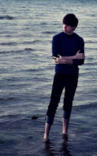
The images I used in the project below and will use in subsequent assignments under this project are taken by myself with a Nikon D40, courtesy of my girlfriend.

Magazine Spreads:


Our first assignment was to find three of an existing magazine, and then make three magazine spreads about our location using a story we had written in the format of the magazine we chose.

I'm not very happy with these as I was confined to using the setup of the magazine I chose: "Alternative Press." Stores usually only sell the existing edition of a magazine, and so while I have many magazines at my house, I had none at my campus apartment and so was forced to use a music magazine that has pretty bad layout and type choices because it was the only one I could get three of. Overall it was interesting, because if I ever work for a magazine firm in the future, it is good to know how to conform to their themes, style and formats.